Content on this page requires a newer version of Adobe Flash Player.

Get Adobe Flash player

Hidden Pages

Entries in Design (28)

Tuesday
Jul192011

Retro Poster Love

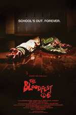
Official poster for The Bloodfest Club. Printed size is 27x41.The one project that keeps giving me more and more fun stuff to do is The Bloodfest Club, and to continue that streak we just did a cool poster design. Somehow this project keeps sending me back to the world of John Carpenter again and again... which I don't mind one bit. This time, I referenced movie posters for flicks like The Thing to capture that simple, yet aged quality. Of course, once all the pieces were in place, I added some texture to give it that aged and weathered look... which I love.

I'm just keeping my fingers crossed that the Bloodfest boys keep bringing me fun stuff to do. It all started out as a little website job, and since has blossomed into a myriad of things. For example, you can see (several posts down) the trailer that I provided some original score for, as well as the final mix. It's one of those things that I love about word of mouth... I had scored some projects their editor had worked on, and he threw my name out to help with the music (it also turned out that an old band of mine had played shows with the lead actor's previous band... another connection). Somehow I got the word that they weren't happy with the mix of the trailer, so I offered to give it a stab. They liked it.

Before I forget, I wanted to share an alternate idea for the poster. One that I think we all liked, but it just didn't quite fit the vibe exactly right. Check it out. I've got a weak spot for that white logo on the red (and I've never been opposed to neatly stacked and justified text)... but it doesn't scream 80's horror as effectively. 

So that's pretty much it. Nothing ground-breaking, but a fun project nevertheless. I'm excited to share that the short film sounds like it's getting close to release, so keep your eyeballs peeled. 

Monday
Jul182011

From The Farm To The Bag

This has got to be, hands down, one of my favorite projects in a while. The short story here is that Innova is a brand of all natural, real-good-for-your-pet food, and they've just started stocking the food at Petco... so they wanted a fun little video to promote this idea of "from the farm to the bag", so I worked with Brighton Agency to create this animation: 

Working with a few of the cool kids over at Brighton, we came up with the general concept, wrote and recorded the song, scripted and storyboarded the visuals, and then I animated for a few weeks. With a super short deadline, we cranked hard on this to get it to come together, but even still it was a great time. It kept me up late at night and had me up early to start working on it again each day, but even at the end, I was still laughing at how the carrot dances. He's a pretty bad dancer, since I used myself as the basis for his movement.

I'm going to be putting together an epic tutorial (let's hope epic wasn't too big of a word to use there... we'll see) on how all of this was put together, as it's a great example of how the Adobe Creative Suite can work pristinely with itself in the right circumstances. This stuff started in Photoshop or Illustrator, went to Flash, and then was smooshed together in After Effects... and later edited in Final Cut Pro... although I would probably opt for Premiere to edit now. Oh well, the chain is broken. Still, I learned a ton of cool tricks and would love to share them.

Anyway, more to come on this later. For now, enjoy the video.

Tuesday
May032011

The Dealership Finale

The season one finale approaches... it premieres May 7th in LA, and then it will proceed to hit the internet like a muffled White Castle fart (I mean that in a good way). I don't want to go into it here, but is it not extremely disconcerting that White Castle smells almost exactly the same after it has been digested? 

Sorry... mega-digression there. Anyway, the point is that I designed this fun new poster for the guys as a giveaway at the premiere. 

Actually, that's not the point at all... the REAL point is that I scored the episode and It's a doozy! It's an 80's horror score, which means it's oozing with old-school, John Carpenter style synths (apparently that's the big thing right now... I seem to be doing a lot of it!). You can keep your eyes out for a little behind-the-scenes video on the making of the score when I get a chance to paste it together, but for now you'll just have to wait with anticipation. 

When this beast goes live, you'll be able to catch it at www.dealershiptheseries.com... and in case you missed the rest of the episodes, you can watch them (plus gobs of bonus clips) right there. Enjoy. Oh, and sorry for mentioning White Castle farts.

UPDATE: The beast is live. Cheque it out below.

Monday
Mar282011

Sill Obsessed With 16 Bit

I am a sucker. Furthermore, I am a sucker for those good ol' 16 bit graphics... so I periodically make myself fancy desktops out of maps from my favorite games. I've posted another Zelda desktop here before... but this one is my favorite. It's 1920x1200 because I love you. 

Click here to download full resolution image

I have always had a great deal of love for the third Zelda game, even from a design standpoint. Being a pretty geeky kid growing up, I thought about that from the moment I first laid eyes on this beast of a game. As far as Super Nintendo games go, this one remains my favorite... and I'd say every few years or so, I end up replaying it just so I can enjoy it all. The artwork, the music, the gameplay... all perfect.

Tuesday
Jan042011

The Bloodfest Club: High School Janitor Vs. Evil

My most recently completed website is this concoction for some filmmakers from the area. The Bloodfest Club is their latest film, which is currently in the works. The award-winning, feature-length script (check out the impressive collection of 'laurels' on the homepage) was pulled from in order for them to shoot a short to help raise funds for the full-length... and from what I understand, that short is in post-production now, so keep your eyes out for it.

What I put together for them is an utterly simple, easy to update, Squarespace site. Because this site is mainly meant to promote the short film, we decided to keep it basic and relatively clean for a horror film (well, horror-comedy)... with the intention that the site for the full-length version would be much more action-packed and exciting. Plus, quite frankly, they're raising funds now to shoot that film... it didn't make sense to spend a ton of time and money on this site... but using Squarespace, I was able to make something that feels polished enough to be professional, but still with that sprinkle of fun in there.

No, it's not some mind-blowing, break-all-the-rules design, but it does what it needs to... plus it totally compliments the 80's, right? The red used on the page, instead of being a blood-red, is the red color that 80's horror movie titles were often done in (I did multiple screen-grabs to sample just the right color). It also reminds me of when you see blood in a cheesy horror movie and its just not the right color at all. You know, comically wrong. I think that phrase actually encapsulates everything we were going for with this... comically wrong.

I'm excited to see where this project goes... it's definitely one to watch. I mean, seriously... who wouldn't be stoked about seeing the horror version of The Breakfast Club? I know am.

www.bloodfestclub.com