Content on this page requires a newer version of Adobe Flash Player.

Get Adobe Flash player

Hidden Pages

Entries in Web (8)

Tuesday
Jan042011

The Bloodfest Club: High School Janitor Vs. Evil

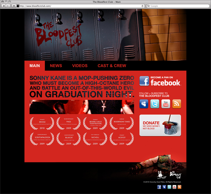
My most recently completed website is this concoction for some filmmakers from the area. The Bloodfest Club is their latest film, which is currently in the works. The award-winning, feature-length script (check out the impressive collection of 'laurels' on the homepage) was pulled from in order for them to shoot a short to help raise funds for the full-length... and from what I understand, that short is in post-production now, so keep your eyes out for it.

What I put together for them is an utterly simple, easy to update, Squarespace site. Because this site is mainly meant to promote the short film, we decided to keep it basic and relatively clean for a horror film (well, horror-comedy)... with the intention that the site for the full-length version would be much more action-packed and exciting. Plus, quite frankly, they're raising funds now to shoot that film... it didn't make sense to spend a ton of time and money on this site... but using Squarespace, I was able to make something that feels polished enough to be professional, but still with that sprinkle of fun in there.

No, it's not some mind-blowing, break-all-the-rules design, but it does what it needs to... plus it totally compliments the 80's, right? The red used on the page, instead of being a blood-red, is the red color that 80's horror movie titles were often done in (I did multiple screen-grabs to sample just the right color). It also reminds me of when you see blood in a cheesy horror movie and its just not the right color at all. You know, comically wrong. I think that phrase actually encapsulates everything we were going for with this... comically wrong.

I'm excited to see where this project goes... it's definitely one to watch. I mean, seriously... who wouldn't be stoked about seeing the horror version of The Breakfast Club? I know am.

www.bloodfestclub.com

Thursday
Sep302010

Award-Winning Award Winners

I'm pleased to share that one of my portfolio pieces is the winner of two TAM awards at last night's ceremony... the Rohan Woods website (a project I directed at SteadyRain) brought a win for both the website and the video.

View in my portfolio here, or check out www.rohanwoods.org.

Tuesday
Aug102010

Rohan Woods School

The Rohan Woods website is a project I worked on as Creative Director at SteadyRain. Aside from creating the design itself, I also led a crew in creating an introductory video to reside in the header throughout the website. As Creative Director, I much prefer to be hands-on whenever possible, and I went to the extreme on this one... from editing DNN modules (to ensure every single one had the correct margins) to personally taking the camera on location and doing pickup shots for the video.

The first comp... loved by designers, but missing the client's vision.That's not to say that this design came easy though... regardless of a fantastic client relationship, it took us a while to get our visions to meet up. I'm still very enamored with some of my earlier attempts, but it just wasn't quite right in the client's eyes. Of course, the designer in me couldn't help but love all the little details in my design... but eventually, after 11 revisions, we arrived at bliss for everyone. While not as graphically rich, the final version is both professional and playful.

Again, this was not a case of blindly missed marks, or a client who is hard to please... it was actually an exciting, shared discovery process. I got a great deal out of working closely with the client to reach the solution, and it taught me a boatload about listening to clients better.

At first, I didn't want to take off my designer's hat and listen to them... my first inclination was to assume that my design was SO great that it was beyond them. Of course, true or not, the goal is to please the client and hopefully to walk out on the other side with something you can be proud to have poured your blood, sweat and tears into... and once I gave up my design ego, it became an invigorating process. My phone calls with the client to discuss changes were more about discussing why I made certain decisions than they were about giving me a list of changes, which I would then have to defend.

The video portion of the project took some work to pull together, and in fact, it was originally envisioned as an audio-and-photography Flash piece. Being new to the idea of working with kids, I over-prepared myself, and as it turns out, I was smart to do so.

We had hoped to get all kinds of great audio snippets of the students talking about the school and then turn them into engaging slideshow audio... but I quickly saw that the visuals were what was going to sell people, and while I still ran audio the whole time, I started shooting video of everyone. As the day progressed, we ended up shooting tons of b-roll as well as some unplanned outdoor scenes too.

Once I was able to get a working cut of the footage together, it was obvious that it made an engaging video, but thanks to an unexpected snowstorm the footage was a bit bleak. After some exterior pickup shooting on a sunny day though, and some levels adjustments to the existing footage, we were there... and I think the final product speaks for itself, as it was intended to all along.

www.rohanwoods.org

Tuesday
Aug102010

laBar

laBar is an upscale bar planned to open in the spring of 2011, in the Midtown area of St. Louis. They came to me to create the entire package, from identity to website, and I was thrilled to be a part of it. I always say it, but it's such a treat to work with people who not only appreciate good design, but enjoy seeking it. That made this an incredibly enjoyable process all of the way through.

In creating this identity, the only guideline was that the 'la' should stand out from 'bar', and based on a slick, modern wallpaper I had seen (and envisioned in the bar itself) I started sketching ideas for this petal. I wanted the petal to be very multi-purpose, usable with or without the text, and so I landed on what is basically a square with two opposite rounded corners. The fact that it's a square makes it lend itself well to patterns, and the plan is to work it into the decor of the bar.

Since the bar isn't open yet, the plan was to create a password-protected version of what the website would be like once the bar was open, as a selling tool for investors. Business cards, stationary, and etc have been created as well so that instead of getting an idea on paper, potential investors get to experience everything but the bar itself. Plus, once the bar opens, everything is already finished and ready to go with just an update of content.

As for the mechanics of the site, it was done entirely in Flash, as is common with bars and restaurants, to allow for a feeling of excitement and drama. I also added in this horizontally scrolling content area, which the user can simply click and drag to navigate. Because it works effortlessly, it adds some fun and makes visiting this site a memorable experience. There's also a slick text-as-graphics animated intro movie using the same descriptive 'la' words found in the site's navigation.

Content on this page requires a newer version of Adobe Flash Player.

Get Adobe Flash player

Because I really dig the intro music, I included a sample of it here. Once you're inside the site, there is a basic music player in the corner that has three different selections as background music to help set the mood. These were intended to be the type of music you might hear upon stepping inside laBar... just another level of bringing the experience to the user.

Since the bar isn't actually open yet, the site remains password protected. Sorry.

Currently, we're working with David Arquette and Ben Harper's clothing line, Propr, to create the apparel for laBar, which is a really great experience. I will undoubtedly be adding those to this post once they're complete.

Tuesday
Aug102010

The Making of A Masterpiece