Content on this page requires a newer version of Adobe Flash Player.

Get Adobe Flash player

Hidden Pages

Entries in Print (9)

Friday
Aug192011

Safe Place Chicago

Recently, I completed work on a print & digital campaign (with local agency, White Space) for Safe Place Chicago, who is trying to raise awareness in the Chicago area. They're working to get more people using the program, but they're also working to get more support and more businesses to step in as the actual "safe places" advertised. 
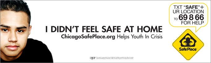
When you're aiming at kids who are living in hell, the hard part is getting away from imagery of that. Kids sleeping in dumpsters and etc... if that is indeed their reality, let's not remind them of that. Eventually, we decided to focus on the idea of looking into the eyes of a kid who has been there and made it out. It was more important to focus on the success stories than the idea of "here's where you are now," and try to put a light at the end of the tunnel. With this approach also came the clean look of everything. Much of the advertising in this area tends towards the gritty and darker look, but we thought more about the kids in the ads talking to you from the other side of everything. 

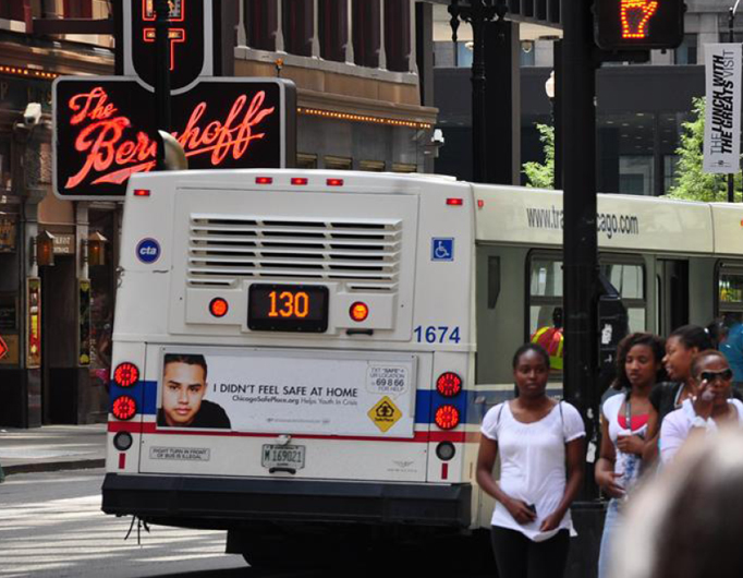
We created 4 different posters, each featuring a different kid, and then spread those across the different print pieces, such as bus and train ads, digital displays, online banner ads and even a unique bench installation.

One of the most important things we needed to push was a call to action asking teens in need to text "help" to a certain number if they felt in need. With today's teens, that's brilliant... they don't even have to talk to someone... just text help + their location and it's on the way. We decided to come up with some sort of lockup that made this highly recognizable and easy to get across, so we wrote in "text-speak," kept it short and placed it in a word bubble to reinforce the text message idea. On the posters, we also added an additional call to action, suggesting that you snap a pic of the lockup so you don't forget it. Just like the idea of texting, with camera phones everywhere, I really felt like this is a brilliant idea to suggest. 

All-in-all, it turned out to be a really slick campaign, and time will tell whether or not it serves its full purpose. White Space was great to work with on this, and brought A+ ideas to the table constantly, which always made my job easier. Well, okay... perhaps not easier... but it always made the work better.

Saturday
Jul302011

Here Are Some Featured Prints

"The West End Of Town" Photography & Digital CollageFor some reason, I've suddenly gotten really jazzed about sharing some of this weird artwork I make. I've been creating stuff like this for a long time... but I'm only just now starting to share it.

Somewhere in my consciousness there is this concept of a place called Orangefield. I've tied things to it before, most notably my musical collaboration (with St. Louis' own Kevin Barry) called Orangefield. Now, I've started to attempt to give it an actual look with its own series of prints. The West End Of Town is the newest addition, and it has just recently become available for purchase on society6.com. I feel kind of like I'm retroactively creating a photo history for this place called Orangefield, and I'd expect there to be lots more to come. Currently, you can check out two other pieces in the series: Orangefield Road and The Old Mainline... and more is coming. I am obsessed with this idea... plus I really dig the look of the stuff.

"The Woodcutter" Photography & Digital CollageAlso high on the list of stuff I'm currently proud of is a new piece called The Woodcutter, also avaliable for purchase on society6.com. I have always, always been a person who gets into anything miniature... I love it. Show me a model of something and I'm giddy. Anyway, from time to time I set up small miniature scenes and grab some shots. This is one I did a while ago, but it still does something for me. It's really simple, but still a bit whimsical.

So that's that.

Saturday
Jul232011

You Can Buy Prints At Society6 Now

I'm excited to announce that I'm starting to make some prints available for purchase (finally)... head on over to my page at Society6 and check it out. They've got a cool setup there... you can choose the size you want, and they'll ship it out. You don't have to wait for me to get my act together and ship something, which means you'll actually get it in a timely fashion!

For now I've got 8 prints available, but there will be more to come. One of my favorite pieces to date (the Orangefield Road print from the Artfix event) is up there, so now you too can own a real "piece of work" for your walls.

Tuesday
Jul192011

Retro Poster Love

Official poster for The Bloodfest Club. Printed size is 27x41.The one project that keeps giving me more and more fun stuff to do is The Bloodfest Club, and to continue that streak we just did a cool poster design. Somehow this project keeps sending me back to the world of John Carpenter again and again... which I don't mind one bit. This time, I referenced movie posters for flicks like The Thing to capture that simple, yet aged quality. Of course, once all the pieces were in place, I added some texture to give it that aged and weathered look... which I love.

I'm just keeping my fingers crossed that the Bloodfest boys keep bringing me fun stuff to do. It all started out as a little website job, and since has blossomed into a myriad of things. For example, you can see (several posts down) the trailer that I provided some original score for, as well as the final mix. It's one of those things that I love about word of mouth... I had scored some projects their editor had worked on, and he threw my name out to help with the music (it also turned out that an old band of mine had played shows with the lead actor's previous band... another connection). Somehow I got the word that they weren't happy with the mix of the trailer, so I offered to give it a stab. They liked it.

Before I forget, I wanted to share an alternate idea for the poster. One that I think we all liked, but it just didn't quite fit the vibe exactly right. Check it out. I've got a weak spot for that white logo on the red (and I've never been opposed to neatly stacked and justified text)... but it doesn't scream 80's horror as effectively. 

So that's pretty much it. Nothing ground-breaking, but a fun project nevertheless. I'm excited to share that the short film sounds like it's getting close to release, so keep your eyeballs peeled. 

Tuesday
May032011

The Dealership Finale

The season one finale approaches... it premieres May 7th in LA, and then it will proceed to hit the internet like a muffled White Castle fart (I mean that in a good way). I don't want to go into it here, but is it not extremely disconcerting that White Castle smells almost exactly the same after it has been digested? 

Sorry... mega-digression there. Anyway, the point is that I designed this fun new poster for the guys as a giveaway at the premiere. 

Actually, that's not the point at all... the REAL point is that I scored the episode and It's a doozy! It's an 80's horror score, which means it's oozing with old-school, John Carpenter style synths (apparently that's the big thing right now... I seem to be doing a lot of it!). You can keep your eyes out for a little behind-the-scenes video on the making of the score when I get a chance to paste it together, but for now you'll just have to wait with anticipation. 

When this beast goes live, you'll be able to catch it at www.dealershiptheseries.com... and in case you missed the rest of the episodes, you can watch them (plus gobs of bonus clips) right there. Enjoy. Oh, and sorry for mentioning White Castle farts.

UPDATE: The beast is live. Cheque it out below.